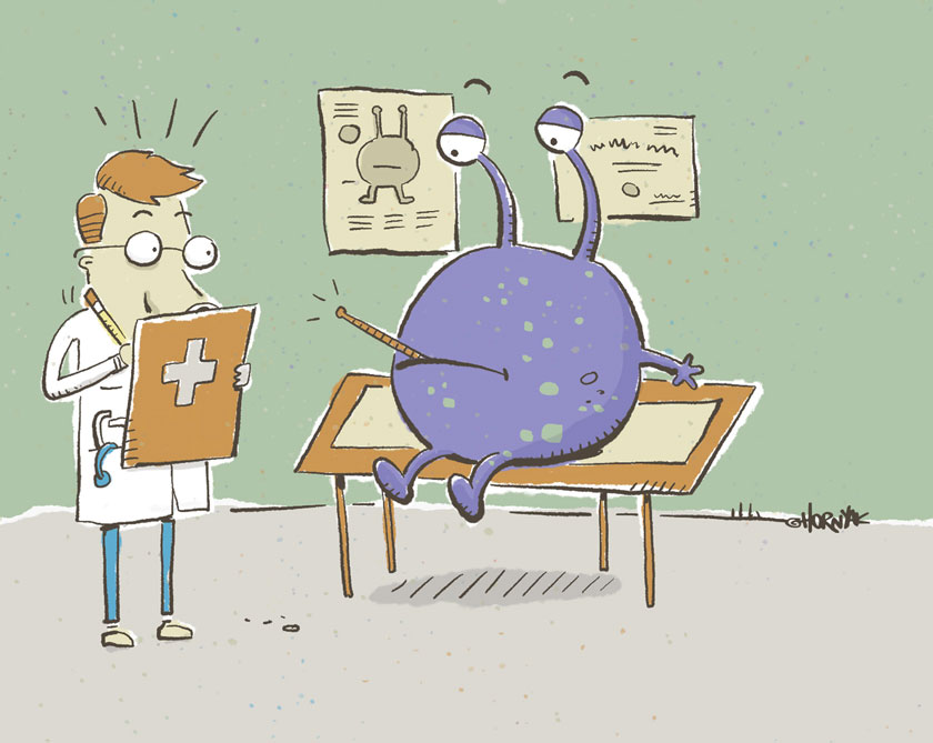
Pop Bottle Studio | Looks like a virus to me
Licensed merchandise creative brand for manufacturers, publishers and consumer lines. Our LOVE-XO line is a sure winner with its blend of bold, graphics, logos, and well structured graphic design. This line looks fantastic in clothing, linens, accessories and decor.
Merchandising Design, Graphic Design, Visual Merchandising, Disney, Universal, Product Merchandising, Illustration, Licensed Merchandise, Textiles, Design, Apparel, Children's Clothing,
649
portfolio_page-template-default,single,single-portfolio_page,postid-649,ajax_fade,page_not_loaded,,select-child-theme-ver-1.0.0,select-theme-ver-4.2,fs-menu-animation-underline,popup-menu-text-from-top,wpb-js-composer js-comp-ver-7.9,vc_responsive
Looks like a virus to me
APP ILLUSTRATION
Used in digital magazine spread
CLIENT
Medical Technology Media
I like to mix old and new, retro and digital, etc. In this case we used hand drawn styling inside a digital magazine. Many of the other screens are filled with digital-looking art, so the retro palette and line work of this section felt like a nice surprise.
Article discussed security in health apps and I went with the “virus that has a virus” theme. The full color background looks great on a tablet.
Fully web and tech savvy (I build web sites as well) I understand what looks best onscreen and how to deliver correctly formatted files. Want to know more?
Let’s talk!


